Project Overview
Edgecom Energy is a SaaS company building modern solutions for the commercial and industrial energy sector, where many organizations still rely on spreadsheets and manual processes. Energy software in this space must also account for complex regional regulations, often across multiple markets. For our clients, this means administrators need a reliable way to manage settings, notifications, and members across their entire organization. The existing settings experience was fragmented between user and organizational pages, creating confusion and making the system difficult to scale as the platform grew.
As the UX/UI designer on this project, I partnered with our Project Manager, Developers, and Operations Team to lead the redesign. My deliverables included:
Information Architecture Map
User Flower
Lo-fi Wireframes
Hi-fi wireframes
Challenges
The current implementation of settings are split between “User Settings” and “Organizational Settings,” which created confusion about where to manage key actions. Key functionality was also missing which resulted in users contacting support just to opt out of specific notifications, since the portal did not provide any self-service controls. For administrators, the lack of clarity made it difficult to oversee settings across large organizations with facilities in multiple regions, each with their own compliance requirements. The current interface itself used a tile-based design that took up alot of space and became unscalable as we added features to the portal. This combination of fragmentation, limited functionality, and poor scalability highlighted the need for a more structured and future-proof approach to settings.
Research
The first step was to conduct research and identify user pain points and distill this information into actionable insights. The three medologies used were: Stakeholder Interviews, Information Architecture Audit, Analytics Analysism, and Competitive Analysis.
Stakeholder Interviews
Since I did not have direct access to end users, much of the insight came from reviewing support tickets and speaking with the customer support team. A recurring theme was the lack of control users had over the notification system. Notifications were inherently complex due to regional program requirements and multiple delivery methods (SMS, email, and phone). Users had no way to manage these themselves, and instead had to contact support to make changes that would apply for the entire Peak/Demand Response season. This created frustration for customers and placed a heavy burden on the support team.
I also conducted interviews with internal stakeholders, including the product manager and customer support staff. These discussions helped clarify how the product was expected to scale and what the settings experience would need to support future growth. One major limitation was the existing tile-based design, which consumed excessive screen space and became unwieldy as more features were added. The support team also flagged ongoing confusion caused by splitting controls between “User Settings” and “Settings,” which made navigation inconsistent and difficult to explain to customers.
Analytics Analysis
We utilize Microsoft Clarity to monitor portal activity and user behavior issues. There are four main metrics I look at to flag potential usability issues: Rage Clicks, Dead clicks, Excessive Scrolling, and Quick Backs. Looking back at the past 6 months of data the metrics were as follows
Rage Clicks: 0.26%
Dead Clicks: 11.05%
Excessive Scrolling: 0%
Quick Backs: 0.5%
These metrics flag potential issues, but often times when you analyze the recordings, there aren't any actual issues. Of the four metrics Dead Clicks stand out as a relatively high number, however, upon reviewing footage two types of user behaviors accounted for the vast majority of dead clicks.
Users clicking on white space as if they're fidgeting.
Users clicking on plain text as they're reading and thinking.
These represented benign use behaviors and did not indicate any underlying issue with information architecture or user flows.
Information Architecture Audit
While there are quite a few categories to group settings into, our IA requirements are wide, but not deep. The goal was the improve clarity and usability. The following represents a map of the current IA along with the type of controls in each section:
[map]
The most glaring issue that was brought up during interviews and may not be clear from this IA is that the User Settings and Organizational settings are split into two different places on the UI. Organization settings are located on the side menu bar and always visible. The user settings are accessed via the profile menu, which is hidden. We would need to simplify the structure of the IA and unify it.
Competitive Analysis:
4 Process
Taking what I've learned from research, the next step was to redesign the IA, Create User Flows, Create Wireframes, as well as the final design.
Information Architecture
[new map]
To simplify the structure and unify the settings, I combined both the user settings and organizational settings into a single page. This provided a single entry point to the settings flow. The tile design was removed and replaced with a more scalable, list-style solution based on our competitive analysis. This list-style also allowed us to create a hierarchy and separation of settings, so we can clearly differentiate between user settings and organizational settings.
User Flows
To demonstrate the impact of the redesign, I focused on the two flows that required the most significant updates: Notification Settings and Admin Permission Controls.
As discovered through research, users previously had no way to update these settings aside from contacting support. Notifications were also season-bound due to the nature of energy programs (Summer vs Winter). The flow for Notification Preferences are separated by Programs and regions. For example: Demand Response Ontario, Demand Response Nova Scotia, Peak Prediction Ontario, Peak Production Nova Scotia. Users can enable/disable SMS, Email, and Phone notifications for each of these programs.
For organizational admins, there is an additional section that allows them to control notifications for external recipients. These are people who are NOT users of the platform who admins still need to keep informed.

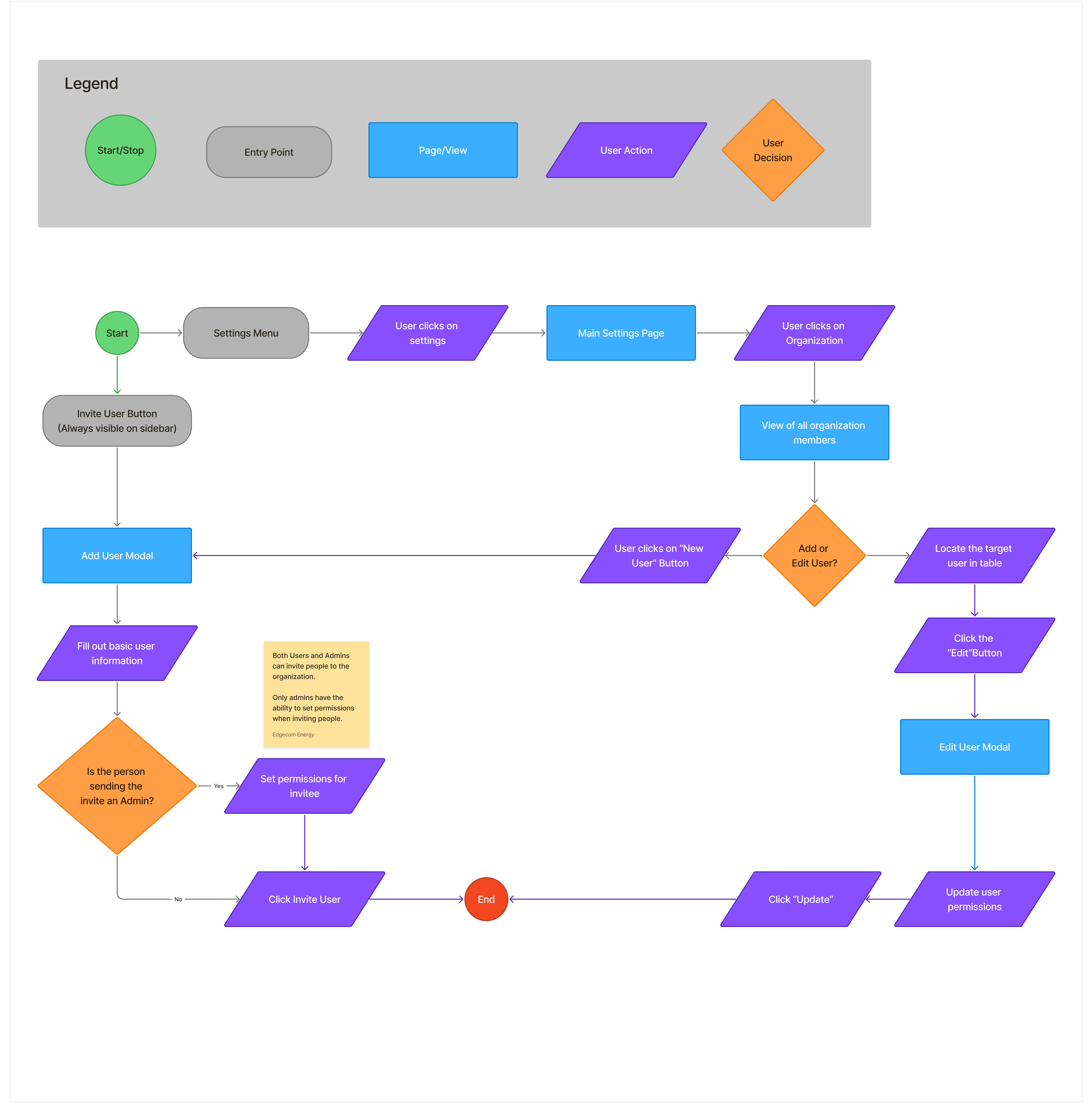
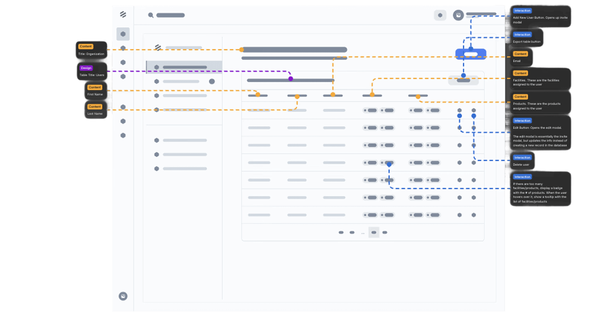
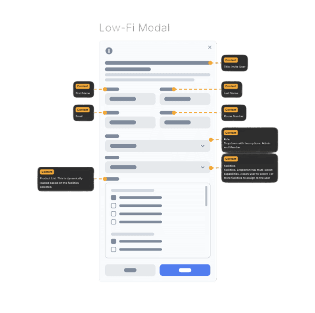
The main purpose of adding admin permission controls is to give organizational admins more flexibility by providing them the ability to assign facilities and individual products to specific users. This can be done in two ways: When you first invite a new user to the platform or within the organization settings page. The userflow below showcases this flow:
Wireframes
At this point in the process, I had a good idea of the requirements and the structure of the designs. I started creating lo-fi wireframes for the notification preferences and ended up with 3 iterations/feedback rounds. The first iteration shown below included a section for personal information and had products split into different tabs. See the screenshot belong along with annotations:
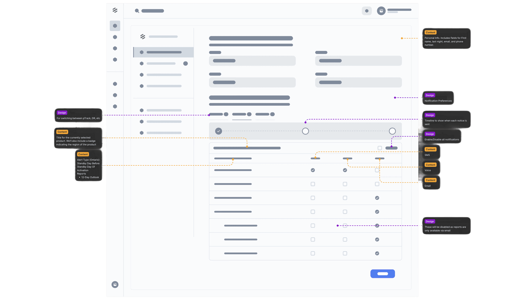
In the second iteration, the personal information section was moved to its own section of the settings hierarchy. This was done to ensure it's more scalable when we add more fields there. We also separated the product regions and grouped them into collapsible accordions to provide a cleaner look.
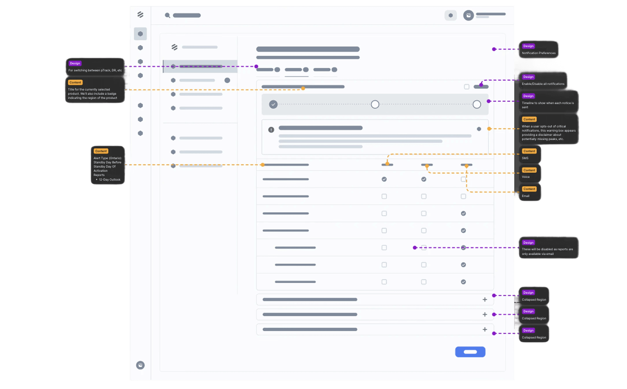
In the final revision of our lo-fi notification wireframe, we iterated on the accordion design and removed the product tabs. Instead, we combined the different products into a single view by grouping them into different accordions. This was done to reduce navigation friction and improve scannability; users can now see all available products in one view.
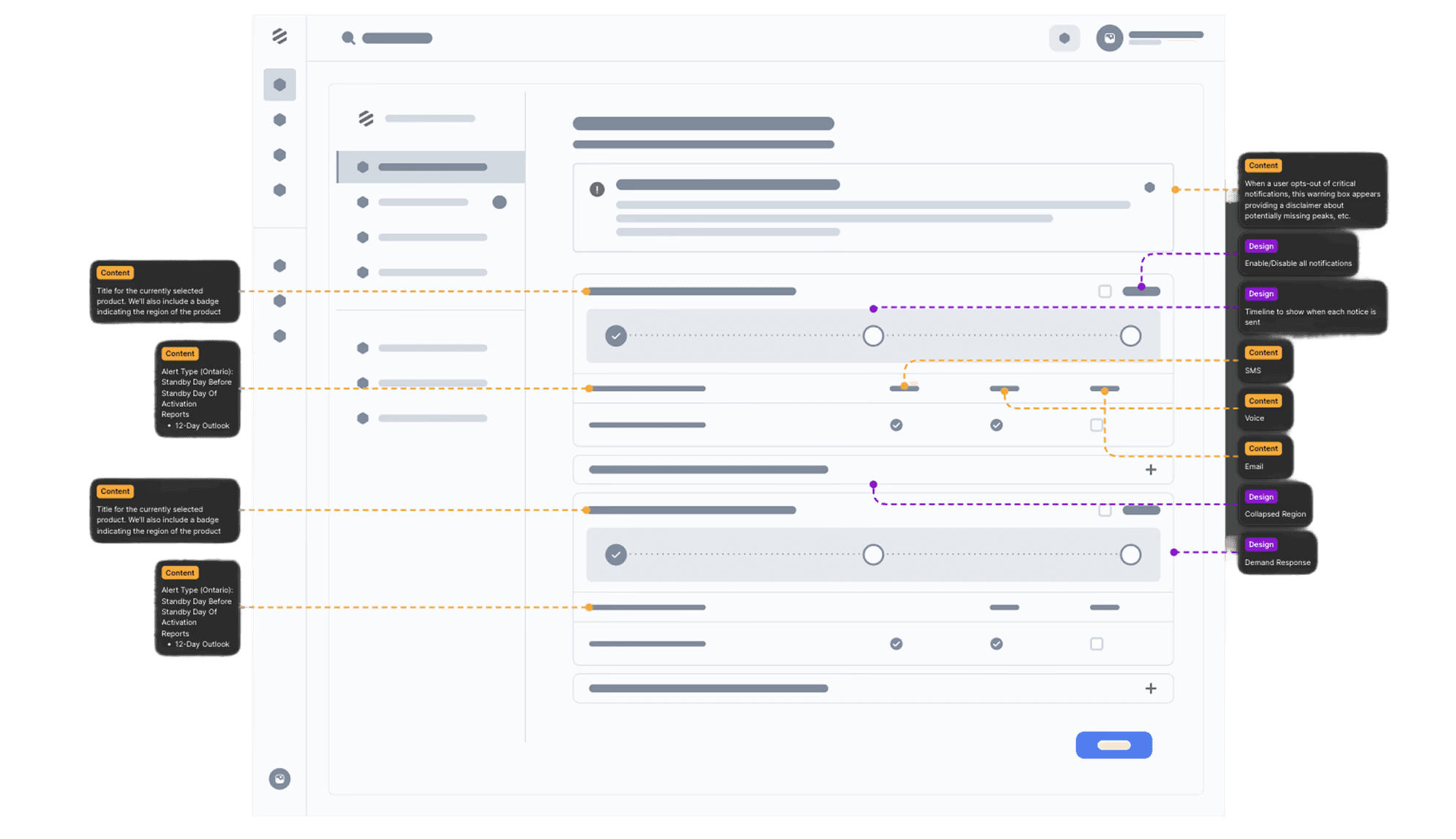
At this point in the process, a new requirement was given to me. With the lo-fi wireframes already approved, I had already started working on the hi-fi wireframes. We needed a way to add external members who were not part of the system and allow admins to control notifications for them. As we had a tight development deadline due to the Peak Season beginning soon, I elected to skip another round of lo-fi designs, integrate this new requirement directly into the hi-fi design, and iterate on it later. The screenshot below shows the final hi-fi wireframe "Add External Notification Recipients" section that was not part of the original designs.

The second key flow we updated was the organization view. This view shows a list of users for that organization. This was redesigned to showcase a the facilities and products assigned to each member and allowed the admins to update it.
The screenshot below shows the wireframe of the invite/edit user modal. There are two ways to trigger this, the first is a dedicated "invite" button that is always visible on the left sidebar. The second is the invite member button on the organization page. When the admin clicks on the "edit" button on a user, this modal pops up with information already pre-filled and can update permissions as necessary.
The screenshot below shows the hi-fi wireframe:

The final hi-fi wireframe of the new organization page is shown below:

Final Solution
Impact and Reflection
The redesigned settings experience delivered meaningful improvements for both end users and administrators. By introducing a clearer hierarchy and consistent visual structure, the interface became easier to scan and navigate. The move away from a tile-based layout allowed the settings page to scale as new features were introduced. On the notifications side, users gained direct control over their preferences, while administrators could now assign notifications to external members without relying on support. We also expanded admin functionality to include role management and the ability to assign facilities and products to individual users.
These changes not only simplified navigation but also reduced confusion and dependency on customer support for basic tasks. Internally, the support team reported fewer tickets related to settings and notifications, and organizational admins told us that it was much easier to organize their members across their organizations.
✅ Created a scalable information architecture that supports future product growth
✅ Simplified navigation with a clearer hierarchy and unified settings hub
✅ Enabled users to manage their own notification preferences without contacting support
✅ Added functionality for admins to assign notifications to external members
✅ Expanded admin controls to include roles, facilities, and product assignments
✅ Reduced support tickets related to notification management and settings navigation
35%
25%
84%
UX/UI Designer
Project Lead
Project Type
Website Redesign
Duration:
2 Months
