Aurum Wealth is a personal finance app I designed for Canadians. It keeps track of the registered-account room your bank and the CRA can’t show you in real time, and it pulls a scattered financial life together into one place that finally makes sense.

Role
Solo Designer–Developer
Project Type
Full Stack App
Aurum Wealth is a personal-finance product I designed and built for Canadians. The core design decision was to keep the one honest habit of logging a transaction by hand, but make that single entry earn its keep, flowing automatically into your net worth, subscriptions, goals, and insights. Above all, it tracks the contribution room left in your TFSA, RRSP, and FHSA. That’s the Canada-specific number your bank and the CRA can’t show you in real time, and the part almost every other app skips.
The Problem
The first: how much room is left in your TFSA right now? I couldn’t answer it. My accounts were spread across three banks, the CRA’s figures lagged by months, and overcontributing costs 1% a month in penalties. If the app understood the rules, the user wouldn’t have to.
The second is more everyday: your financial life lives in about ten places at once. Balances in one app, transactions in another, a forgotten subscription in a card statement, goals in your head. None of it adds up to a single picture, so you never quite know where you stand.
I wasn’t designing for a demographic so much as for a specific person with a specific, recurring headache. Picture someone who earns well, treats their registered accounts as a real strategy rather than an afterthought, and has slowly made peace with the fact that their setup, a spreadsheet plus a brokerage login plus a CRA page that’s always behind, simply can’t answer the one question they care about, which is how much room do I have left, today?
Before I built a single thing, I took a hard look at everything I’d been using, and each one taught me something useful about the gap I was staring at. The pattern was tough to miss. The polished apps weren’t built for our system, and the one app that actually did the tracking job had already disappeared.
The Core Idea: Log Once, See Everywhere
This is really the heart of the whole thing, and it came straight out of my spreadsheet frustration, because what I wanted was to log a transaction one time and have everything else quietly update itself. So that’s how Aurum behaves. You add a transaction and it propagates outward, adjusting your net worth, updating your contribution room if it belongs to a registered account, showing up in your subscriptions if it’s a recurring charge, and nudging a goal forward if it moves you closer to one. You enter reality once, and the app keeps every view honest after that.
Each of those views then gets its own clean, focused space, whether that’s a net worth breakdown, a registered accounts page, a subscriptions tracker, or a goals board, so you can zoom in on one part of your finances without losing sight of the whole. That, more than anything, is the thing a spreadsheet could never quite give me.
Log once, and every view stays in sync


Registered Accounts, Done Properly
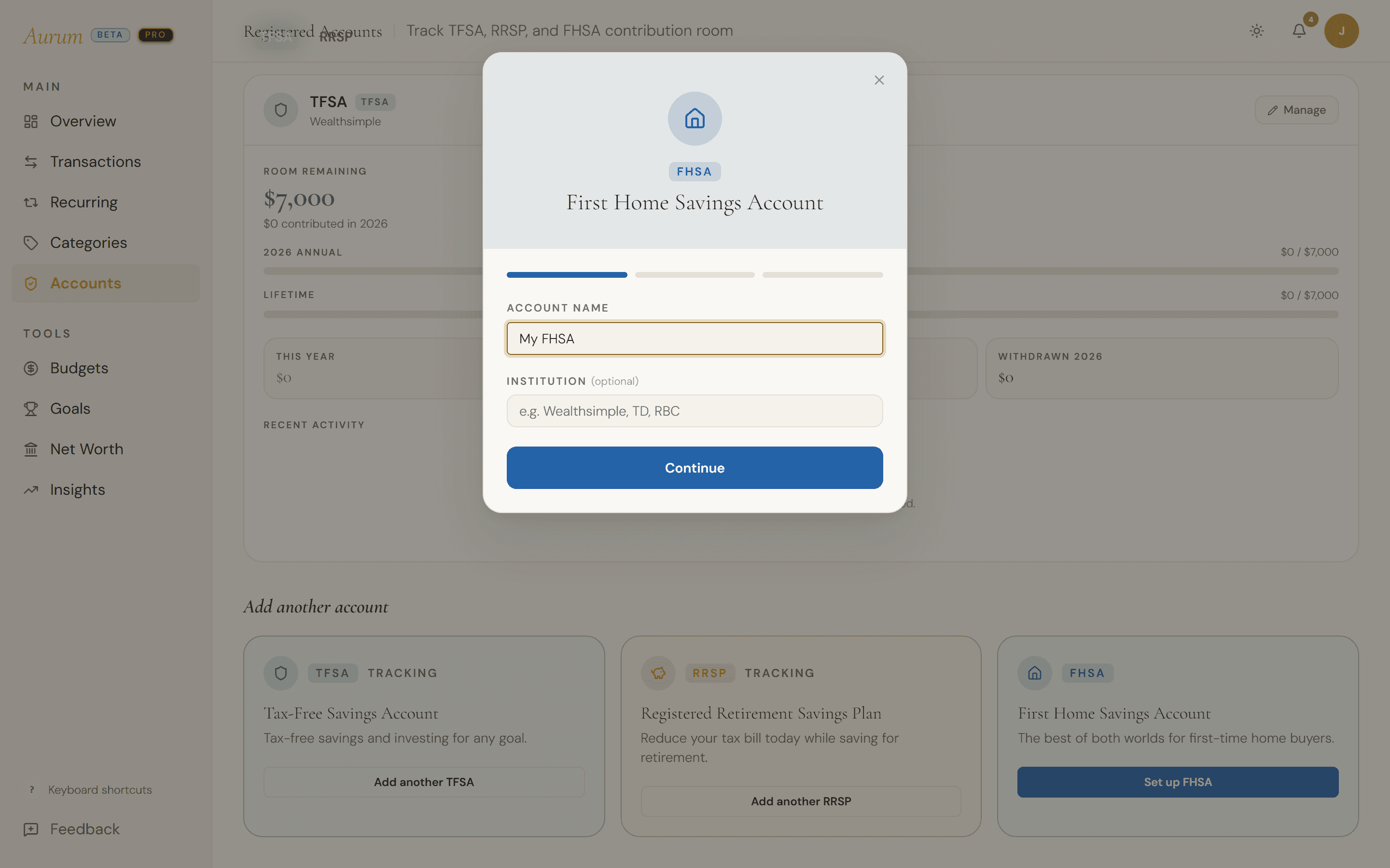
If the app is going to claim it understands Canadian accounts, then it had better actually understand them, because the math is where the credibility lives. Aurum implements the real rules, from RRSP room as eighteen percent of last year’s income up to the annual cap, to the FHSA’s yearly and lifetime limits, to the TFSA’s withdrawal room returning the following January. Get all of that right and you’ve handled the part nobody else seems willing to touch.
The hardest design problem here wasn’t the math, though, it was the starting line. Almost nobody begins from zero, since most people already have years of contributions sitting in accounts across different banks, so the moment someone adds a registered account you have to answer an awkward question: what balance do you show them? I designed the setup to meet that head on, so if you know your exact contributions you type them in, and if you don’t, the app can reconstruct them from the historical transactions you’ve already logged. And if you’re not in the mood for any of it, you skip it, because registered accounts are completely optional. You can use Aurum purely to log transactions and never set up a TFSA in your life. That last decision mattered more than it sounds, because the app had to feel right both for the person who wants the full registered-account picture and for the person who just wants to watch their spending, without either feeling like they picked up the wrong tool.
Registered-account room — the differentiator

Making It Make Sense
Logging everything in one place only helps if you can actually read it, so clarity became its own design problem, separate from collecting the data. The single most important number in personal finance is a humble one, whether you made more than you spent this month, and it sits right at the top of the overview as the first thing you see every time you open the app. My favourite piece, though, is the monthly ledger, which is a calendar and a heatmap rolled into one, so at a glance you can see which days you spent the most, and the moment something catches your eye you can click into that date and see the exact transactions behind it. I built it because I wanted it for myself, and it’s still the first view I reach for.
Beyond that there’s a dedicated insights space for the deeper material, with things like savings-rate projections, a gentle heads-up when you’re spending more than your own history says is normal, cashflow diagrams, and spending trends. The point was never to bury you in charts, but to answer the questions you’d actually ask and then get out of the way.

Open up ten finance apps in a row and they blur into one another, all cool blues and hard edges and the same sterile competence, and I wanted Aurum to feel like the warm, personal, slightly elevated opposite of that.
The palette
The direction took its cues from old-world, high-touch banking, the feeling of sitting across from someone who actually looks after your money. That shows up in the gold and the warm browns, the off-whites that lean closer to vellum than to plain white, and the deliberate absence of any harsh colour. It reads as considered and grown-up, and as a happy bonus it just doesn’t look like everything else out there, which was half the goal.
The motion
The motion carries the same intention, with everything easing in slowly under a soft golden glow and nothing ever snapping or bouncing into place. Slow, deliberate animation gives the whole app a calmer, more intentional feeling, as if it’s in no particular rush and figures you aren’t either.
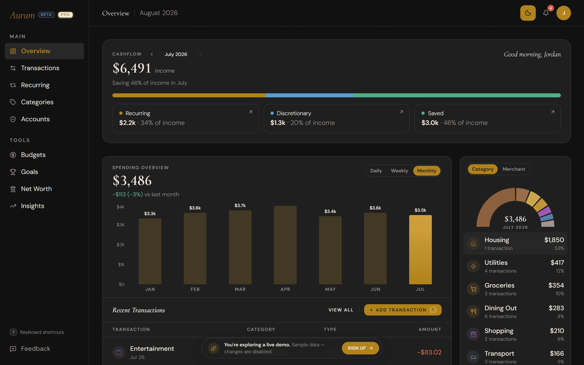
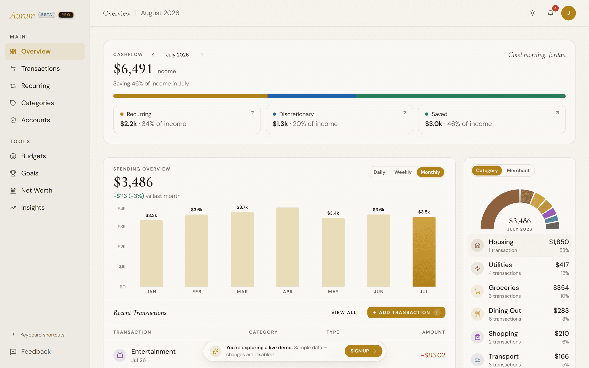
One system, light and dark
Building It with AI
I can design a product. I can’t build one, at least not the backend, front-end, database, and deploy pipeline that turn a design into a working app.
That gap is exactly where AI changed what one person can do. I paired with Claude Code to write and test the full-stack code, wire up a complete Supabase data layer, and ship it to production on Vercel. As a product designer, I could take Aurum from first screen to a real, deployed product on my own, no engineering team required.
The Decision I Sat With, and What’s Next
Here’s the decision that actually kept me up at night: should Aurum log your transactions for you? The easy answer is an obvious yes, because I could wire up something like Plaid, pull transactions in automatically, and a good number of users would happily take that deal. I decided against it, for two reasons that both come back to respecting the person using the app.