Transforming a confusing settings flow into a clear, scalable hub for admins and end users.
Edgecom Energy is a SaaS company building modern solutions for the commercial and industrial energy sector. Energy software in this space must account for complex regional regulations, often across multiple markets. For our clients, this means administrators need a reliable way to manage settings, notifications, and members across their entire organization. The existing settings experience was fragmented and was designed in a way that prohibited scalability.
As the UX/UI designer on this project, I collaborated with our Product Manager, Developers, and Operations Team to lead the redesign. My deliverables included:
Information Architecture Map
User Flower
Lo-fi Wireframes
Hi-fi wireframes
The current implementation of settings is split between “User Settings” and “Organizational Settings,” which created confusion for users.
Key notification settings were missing which resulted in users contacting support just to opt out of specific notifications, creating unnecessary workload.
User admins lacked the ability to manage settings across large organizations with facilities in multiple regions, each with their own compliance requirements.
The current interface itself used a tile-based design that took up alot of space and became unscalable as we added features to the portal.
One major constraint was my lack of direct access to users. Instead I relied on support tickets and interviews with the customer support team and product manager to generate the following insights:
Notifications were inherently complex due to regional program requirements and multiple delivery methods (SMS, email, and phone). Users had to contact support to make changes that would apply for the entire Peak/Demand Response season. This created frustration for users and placed a heavy burden on the support team.
There was need for a more scalable settings experience. The existing tile-based design consumed too much space and became unmanageable as features are expected to grow.
There was confusion caused by splitting controls between “User Settings” and “Settings,” which made navigation inconsistent and difficult to explain to customers.
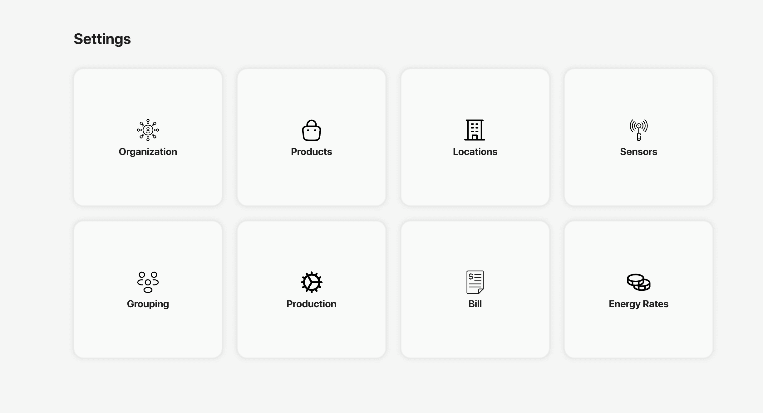
The original tile-based design of the settings page.
We utilize Microsoft Clarity to monitor portal activity and identify potential usability issues. There are four key metrics I focus on: Rage Clicks, Dead Clicks, Excessive Scrolling, and Quick Backs. Each provides a signal into possible friction points. Rage Clicks indicate frustration when users rapidly click on an element that isn’t responding. Dead Clicks show when users click on non-interactive areas, which can point to unclear affordances or potential bugs. Excessive Scrolling may suggest that content is too long or poorly structured, and Quick Backs occur when a user immediately returns to the previous page, signaling unmet expectations such as problems with our information architecture.
Metrics from Microsoft Clarity over the past year.
At first glance, the Dead Clicks metric seemed to signal a major issue. However upon reviewing recordings, it became clear that most cases came from benign behaviors such as clicking on white space while users read or simply fidgeting by clicking on white space. These interactiosn did not indicate a problem with information architecture or usability.
Metrics don't always tell the full story. Deeper analysis can reveal underlying problems.
Lesson
What was much more revealing was deep analysis into Quick Backs. Across the portal, only 0.5% of sessions had a Quick Back with 12.6% of those coming from the Main Settings page. The Users Settings page showed a staggering 100% Quick Back rate: in every session recorded, users left the page immediately. This aligns with what I heard from customer support and suggested that users who entered User Settings looking for the Main Settings. This insight made it clear that we had to unify and simplify the settings flow.
I reviewed a variety of SaaS applications to analyze how they implement their settings pages and identified the following insights on the way setting pages are structured:
The vast majority of apps utilized a vertical menu separated by logical menu groupings. This enabled for scalability and provided improved visual hierarchy.
Notion and Canva both used a variety of different elements (tables, tabs, cards, etc) within their settings to enhance clarity and the data it was displaying.
Having interactable controls right aligned provided for a better experience as it improved scanability and provided better visual consistency.
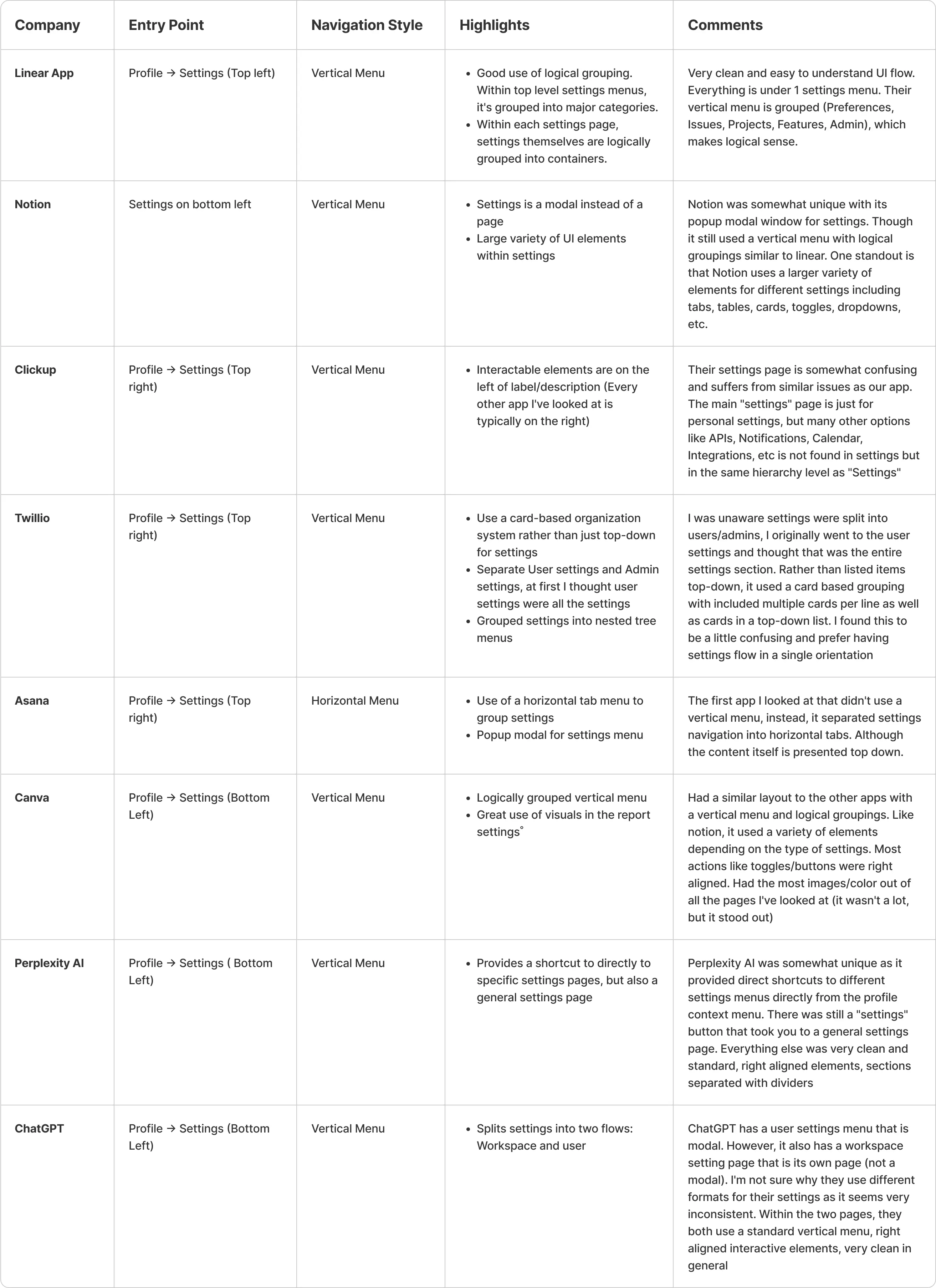
Research notes from a variety of different popular SaaS apps.
Based on the research done and best practices seen in other SaaS apps, I decided to unify the settings pages into a single hub. The personal settings and organizational settings were split as separate logical groupings so users will still be able to quickly differentiate between the two types of settings. Based on a vertical menu architecture, this will enable us to migrate away from the current tile-base design and enable scalability and better grouping.
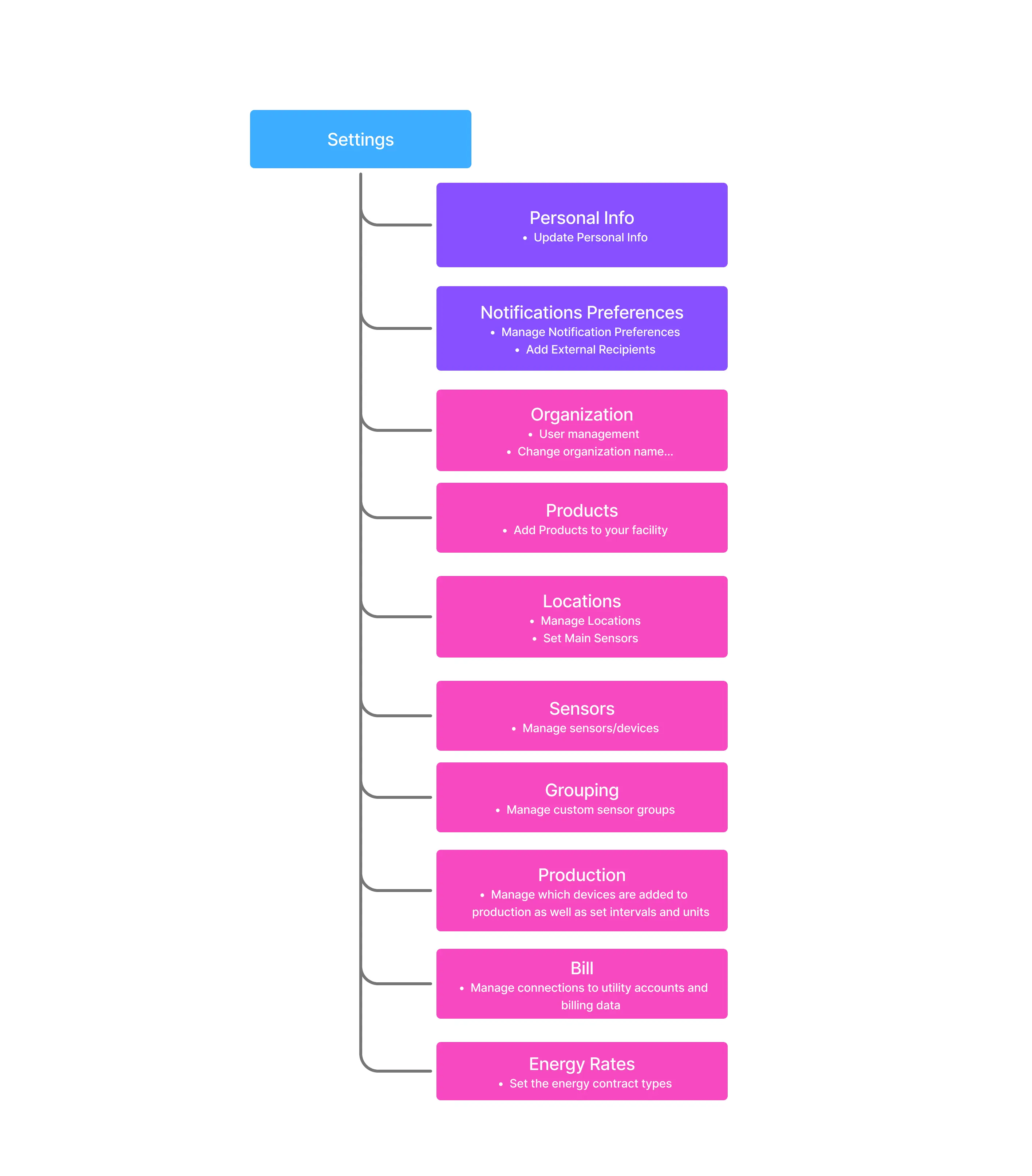
Updated IA of the settings page. The purple boxes represent User Settings and pink boxes represent Organizational Settings
To highlight the impact of the redesign, I focused on the two flows that required the most significant updates: Notification Settings and Admin Permission Controls.
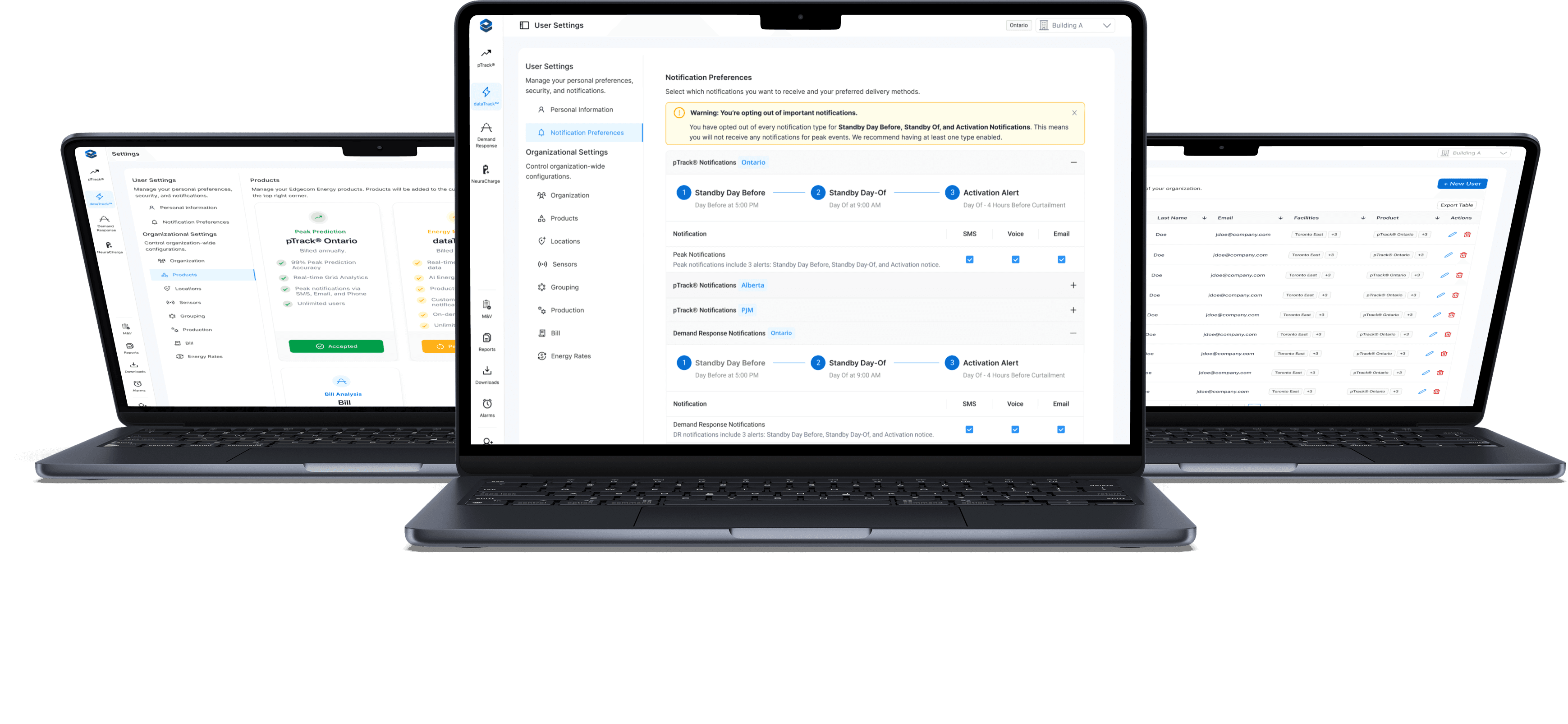
Research revealed that users previously had no way to update their own notification preferences and had to contact support instead. Notifications were also season-bound due to the nature of energy programs (Summer vs. Winter), which added complexity.
In the redesigned flow, notification preferences are organized by program and region. For example, a user can now manage settings for Demand Response Ontario, Demand Response Nova Scotia, Peak Prediction Ontario, and Peak Prediction Nova Scotia individually. Within each program, users can enable or disable delivery methods such as SMS, email, and phone. In addition, admins get a conditionally rendered view with controls for adding external recipients as well as controlling their notification settings.

User flow to update notification settings
The current design of the organization menu only listed the active members with basic controls such as switching roles. The new design was built in collaboration with our backend engineers to rework how objects were mapped to users and expand admin controls. For example, admins can now assign individual facilities as well as products to each member, allowing them to only have access to those datasets. This provides flexibility to our users, as some managers may need to manage multiple facilities within a region, while others do not.
The updated flow also takes into account two entry points into the flow: the normal entry within the organization settings menu, and an "Invite" button that is always available on the side bar. This Invite entry into the flow allows admins to quickly add new members and setup their permissions from anywhere on the portal. By streamlining the flows and updating our backend data structures, we created a much more flexible and clear user flow.
User flow for invite/updating new members and setting their permissions.
With the requirements and structure defined, I began wireframing the notification preferences flow and iterated through three rounds of lo-fi designs.
Iteration 1: Included a personal information section and split products into separate tabs.
Iteration 2: Moved personal information into its own section of the hierarchy for scalability, and grouped product regions into collapsible accordions for a cleaner layout.
Iteration 3: Refined the accordion design further by removing product tabs and consolidating everything into a single view. This reduced navigation friction and improved scannability by allowing users to see all products in one place.


Lo-fi wireframe iterations for the notification settings page.

Final hi-fi wireframe of the notification settings


Lo-fi wireframe of the Admin Permissions Control


Final hi-fi wireframe of the Admin Permissions Control
The redesigned settings experience delivered meaningful improvements for both end users and administrators. By introducing a clearer hierarchy and consistent visual structure, the interface became easier to scan and navigate. The move away from a tile-based layout allowed the settings page to scale as new features were introduced. On the notifications side, users gained direct control over their preferences, while administrators could now assign notifications to external members without relying on support. We also expanded admin functionality to include role management and the ability to assign facilities and products to individual users.
These changes not only simplified navigation but also reduced confusion and dependency on customer support for basic tasks. Internally, the support team reported fewer tickets related to settings and notifications, and organizational admins told us that it was much easier to organize their members across their organizations.
Results:
✅ Created a scalable information architecture that supports future product growth
✅ Simplified navigation with a clearer hierarchy and unified settings hub
✅ Enabled users to manage their own notification preferences without contacting support
✅ Added functionality for admins to assign notifications to external recipients
✅ Expanded admin controls to include roles, facilities, and product assignments
✅ Reduced support tickets related to notification management and settings navigation

