Revitalizing Edgecom's Digital Presence for New Markets.
Role
Project Lead
Project Type
Website Redesign
Duration:
5-6 Months
Edgecom Energy is a SaaS company that builds energy management software for industrial clients. As the company prepares to expand into the U.S. market, it became clear that the existing website could not support the business goals. The website felt outdated, lacked clarity, and didn’t position Edgecom as the technology-first company it was becoming.
I was responsible for leading the redesign from start to finish. This included setting the design direction, mapping out the information architecture, coordinating with stakeholders, and developing the site on WordPress. I also worked closely with a third-party animation studio to bring high quality animations to life. My goal was not only to modernize the brand visually, but to build a scalable, user-friendly site that the marketing team could maintain without relying on developers.
We focused on four key objectives:
Modernize Edgecom's digital presence to reflect a technology-first brand
Stand out from slow-moving competitors in the energy industry
Build a flexible foundation to support ongoing content growth
Improve usability for a non-technical, industrial audience
Six months after launch, we saw strong engagement gains when compared to the same period from the year before: 40% increase in engaged sessions 63% increase in average engagement time 156% increase in average session duration.
I began with a competitive audit of regional energy websites and found the same issues repeated: outdated visuals, clunky navigation, and a generic corporate tone. To reposition the brand as technology-first, I deliberately looked outside the industry for inspiration.
Instead of emulating energy peers, I drew from leading SaaS brands like Linear and Stripe, known for their clean layouts, clear messaging, and purposeful motion. Adopting this modern SaaS aesthetic aligned with our target audience, who are typically facility managers in their 40s and 50s, by prioritizing clarity, simplicity, and usability over visual noise. From these references, I extracted key design patterns that became the foundation of our direction.
Information Flow of: Value -> Benefits -> Features -> Social Proof
Minimalistic (Proper use of white space)
Modern Sans typography with proper hierarchy
Subtle motion (Hover, scroll effects)
High-quality mockups
Dark Mode


I started by auditing our existing site and speaking with key stakeholders to identify what content needed to stay, what was missing, and what we might need to support in the future.
One major challenge came up early in the process. While we were designing for future growth, many of the new products and resources wouldn’t be ready by the time we launched. We still needed to account for them in the structure. The solution we came up with was to keep our current drop-down style navigation and also design a separate mega-menu navigation system for when our content will expand.

With the design direction and architecture defined, I moved into lo-fi wireframes for key pages, keeping to our Linear-inspired principles: clean layouts, clear hierarchy, and a strong narrative flow.
We intentionally skipped hi-fi wireframes. The timeline for entering the U.S. market required us to launch quickly so marketing could begin building in WordPress. Given the clarity of our lo-fis and references, it made more sense to move directly into development and iterate in real time rather than slow progress with additional fidelity steps.


One of the key features we wanted for our website was high-quality animations and graphics. Since we lacked in-house expertise, I took the lead on sourcing and vetting external studios.
We were looking for 3 key animations:
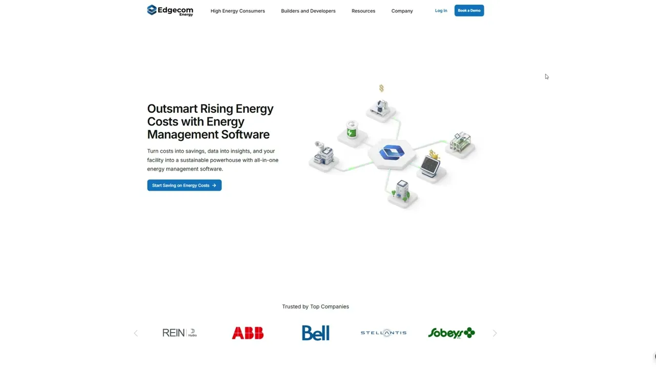
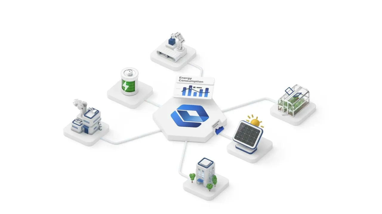
Hero Aniamtion that quickly communicates what Edgecom Energy does.
Data Unification Animation to illustrate how we centralize energy data sources; the core value we offer.
AI Capabilities Animation to showcase our AI Analysis Engine; to showcase our differentiating technology.
For each animation, I held concepting sessions with company leadership to align on our narrative goals. I then translated those ideas into rough outlines and motion notes to help guide the creative direction. After several rounds of iteration and feedback, we arrived at polished animations that brought our message to life in a visually engaging way.


The previous site relied heavily on a combination of blue and yellow that clashed together. A blue and yellow color combination could work for a playful website if one of the colors were used sparingly for accents. However, to align with our direction as a professional SaaS company, I opted to use Blue as the primary color and shifted to whites and neutrals for the rest of the color palette. This gave us a more minimal and clean foundation that better supported clarity and visual hierarchy.

I needed to pick a font that was modern, scalable, and impactful. I chose Inter because of its versatility across devices, ability to scale well, and it was well-supported across platforms. To establish a clear visual rhythm and hierarchy, I used the Major Third typescale (1.25px with a 16px base). This allowed for a bolder effect and strong visual emphasis, perfect for making a statement on a marketing website.

The next phase was development, which I handled entirely in-house using WordPress. We chose WordPress because it was already integrated into our workflow and offered a flexible CMS with a wide range of plugins, which was ideal for enabling the marketing team to take over the website and create content without involving developers.
Our tool stack included WordPress, Elementor, UICore, and GoDaddy Hosting (which we later migrated to AWS as we had credits from funding). Development was straightforward as the design direction was already well-defined through earlier planning and wireframes. Having a clear vision allowed for efficient execution. I also collaborated closely with the marketing team on SEO, ensuring that page copy aligned with our content strategy and keyword goals across the site.
We successfully launched the redesigned site and received positive feedback from both customers and industry peers. In the six months following the launch, we saw a significant uplift in user engagement: a 35% increase in engaged sessions, a 63% increase in average engagement time, and a 156% increase in average session duration. The results showed that users were not only spending more time on the site, but engaging with it in more meaningful ways (scorlling, navigating, interacting, etc). This validated our improvements in messaging clarity, information architecture, and overall usability.
This project was a rare opportunity to take full ownership of a website redesign from concept to launch. By leading the design, development, and coordination with third-party vendors, I was able to ensure a cohesive vision throughout every stage of the process.
Results:
✅ Successfully led the project end-to-end and launched the new website.
✅ Created a solid foundation for scalability and expansion for future growth.
✅ Significant improvements across engagement metrics.
✅ Completed training and handoff to the marketing team.

