Transforming a confusing settings flow into a clear, scalable hub for admins and end users.
The goal of this project was to create a modern data dashboard for the energy industry that integrates with the existing Edgecom Energy platform. The product strategy was two-fold: to provide useful data to support our other energy tools and to target a completely new audience - energy traders.
While most of the energy data is publicly available in a raw format, it is difficult to parse and analyze.
There is a lot of noise with energy data; different roles care about different data sets.
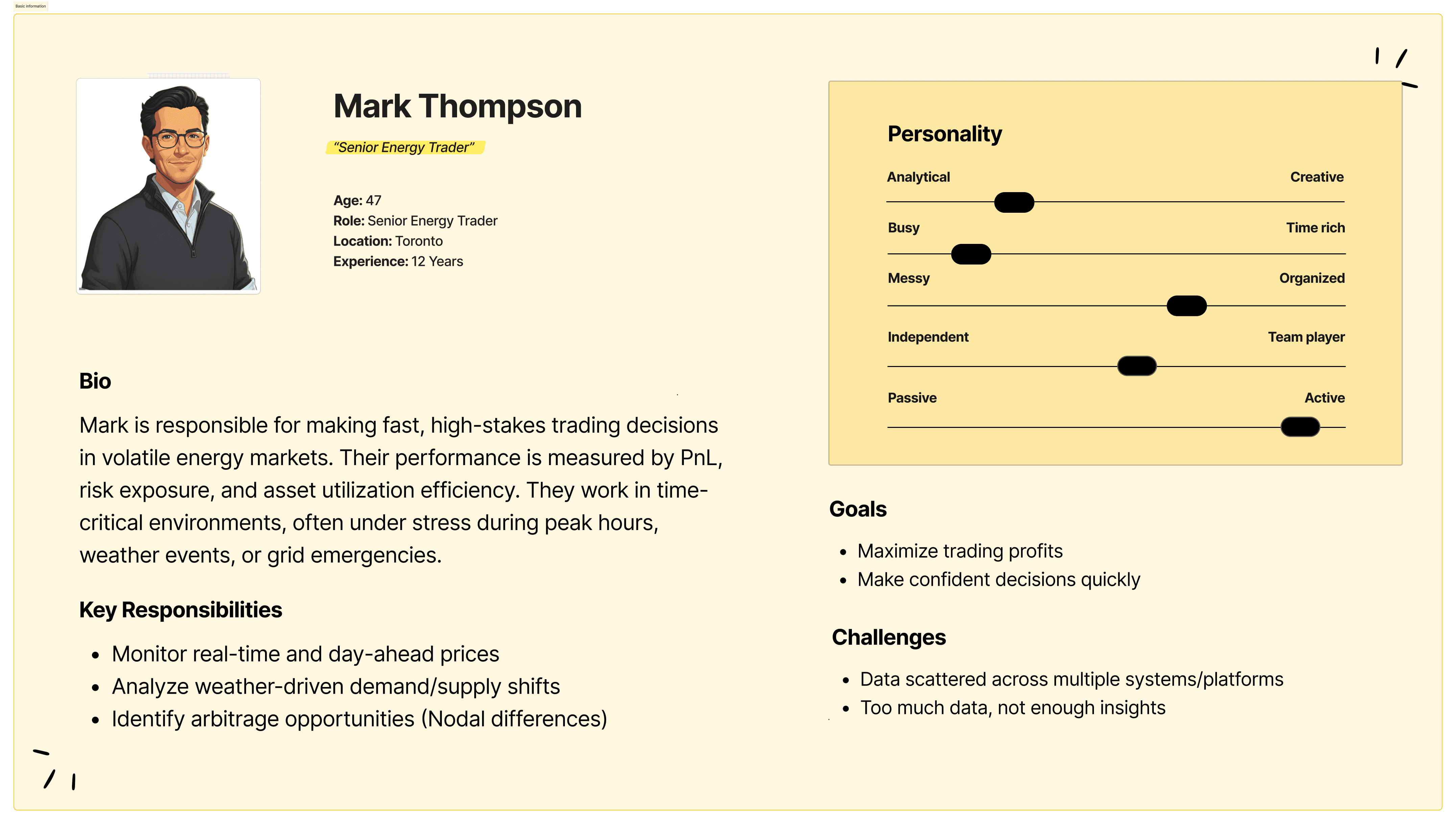
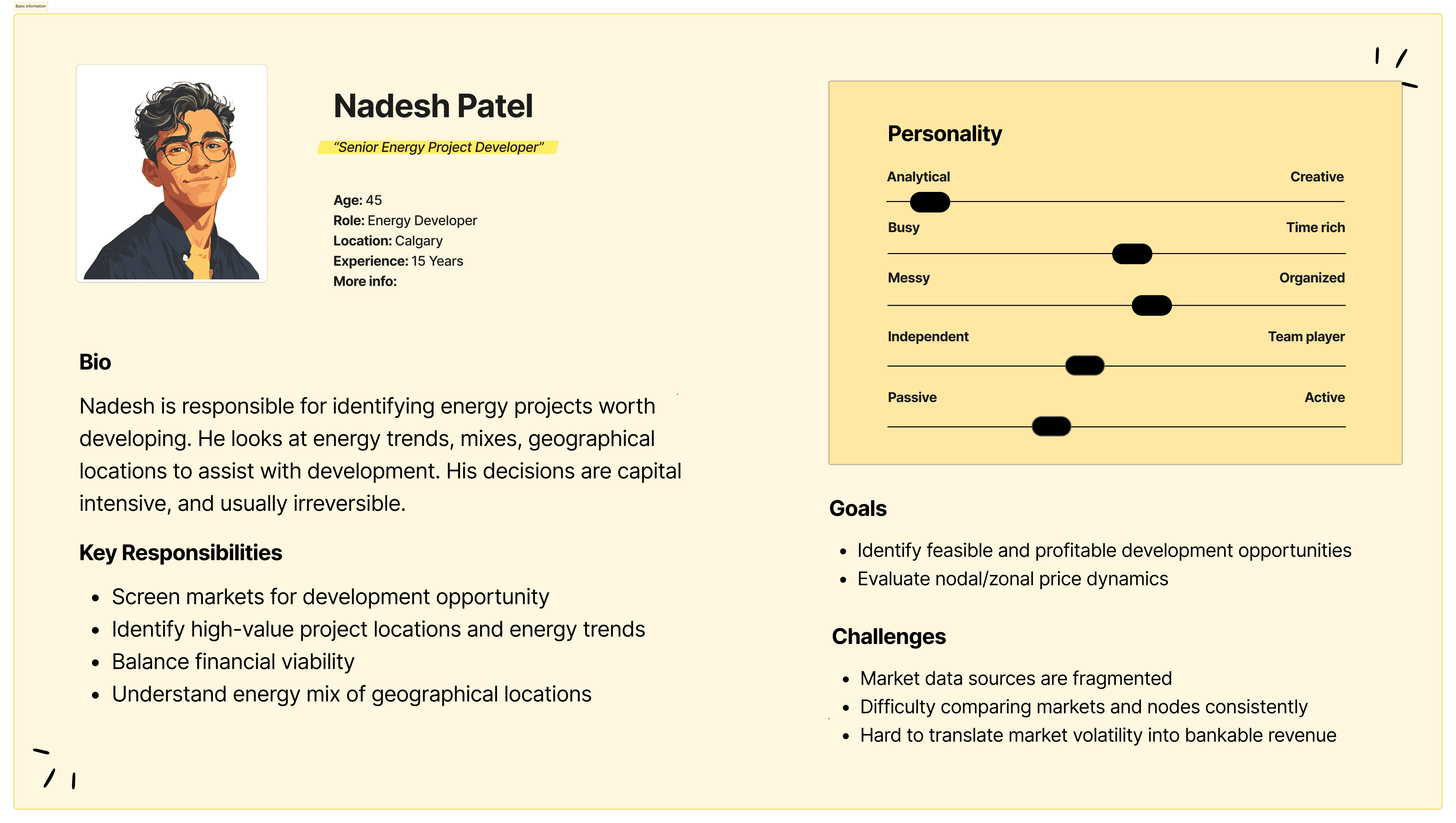
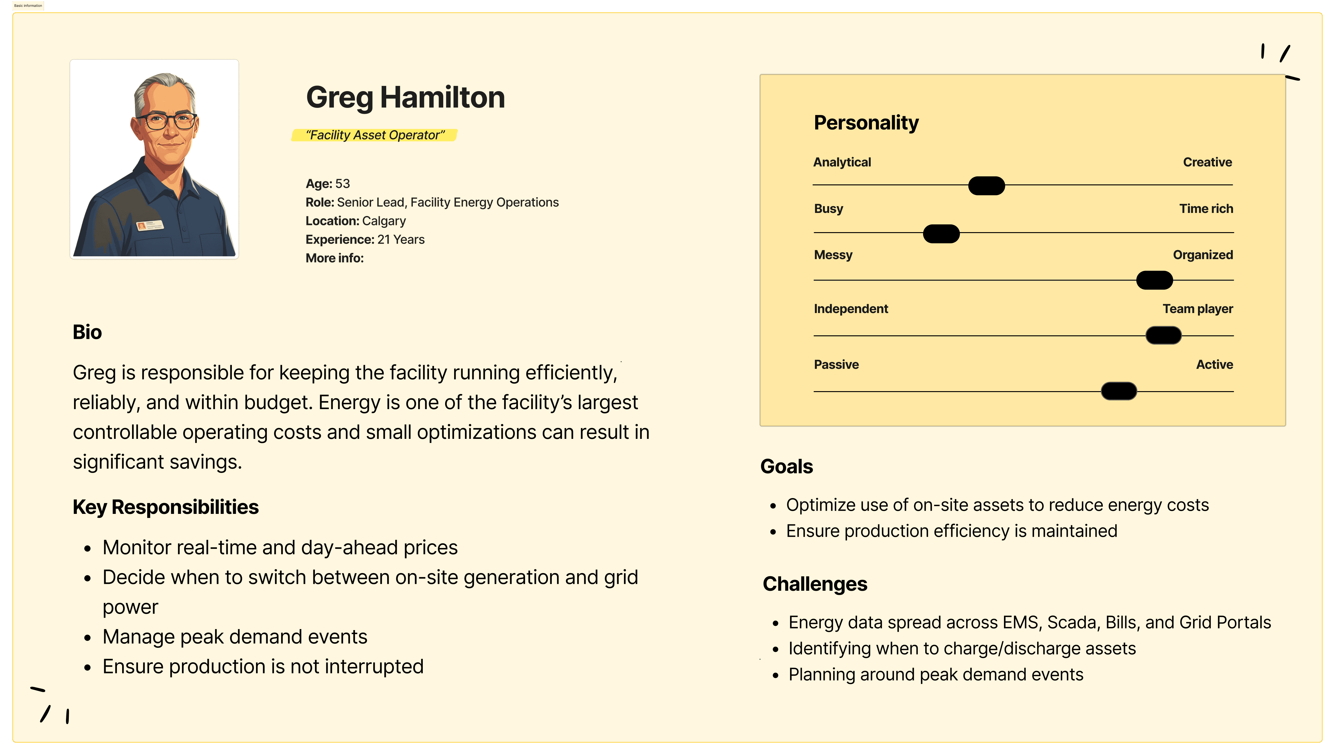
We conducted research into three main groups: Energy Traders, Energy Managers, and Energy Developers. All three groups utilize energy data, but prioritize datasets in different ways. Through conversations and surveys the following insights were synthesized:
For each role, personas were created to ground design decisions and help us emphasize better with each user group:
Taking data from my research as well as keeping our personas in the top of mind, empathy maps were used to help our team understand and prioritize user needs.
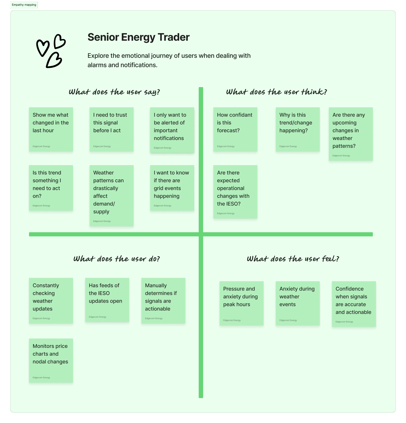
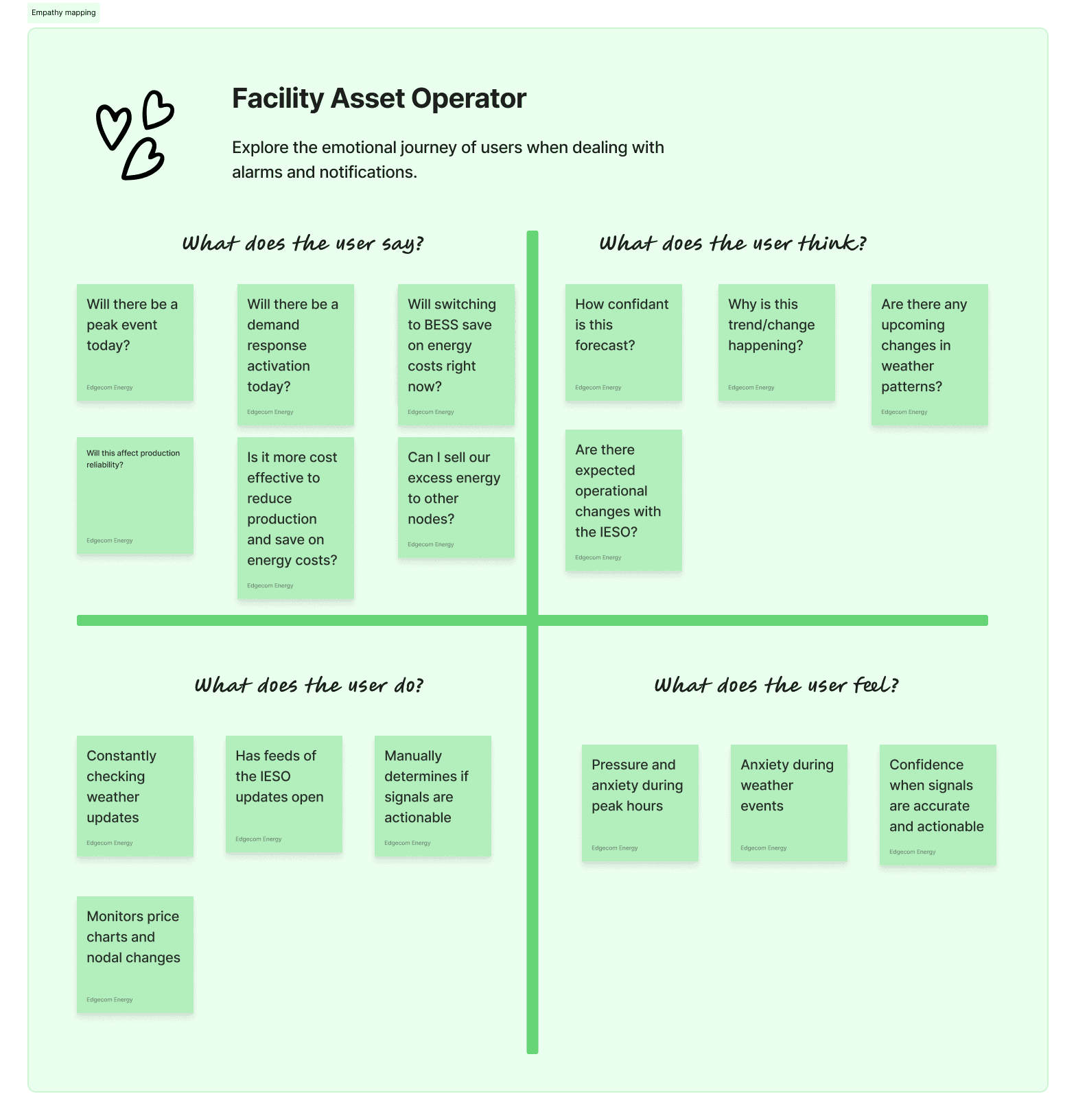
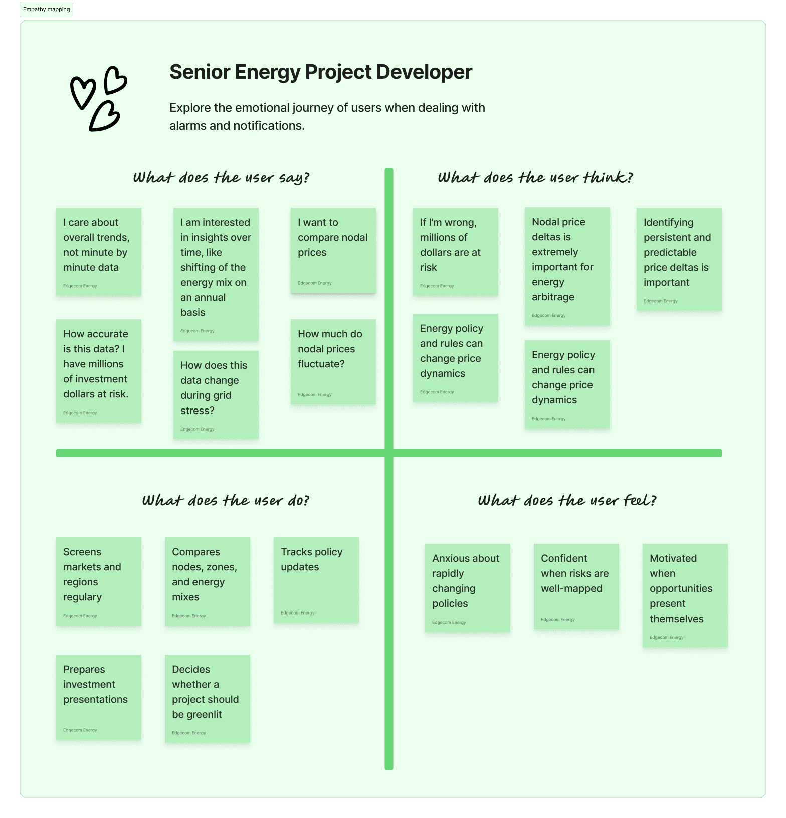
It became clear from our empathy maps that there were 2 core issues:
1. Users needed to be able to focus on data they care about
2. Users needed to be able to trust the data
We proceeded with our product design based on these two guiding principles:
Reduce cognitive load and help users focus on what's important.
Guiding Principle 1
Show users that the data is trustworthy.
Guiding Principle 2
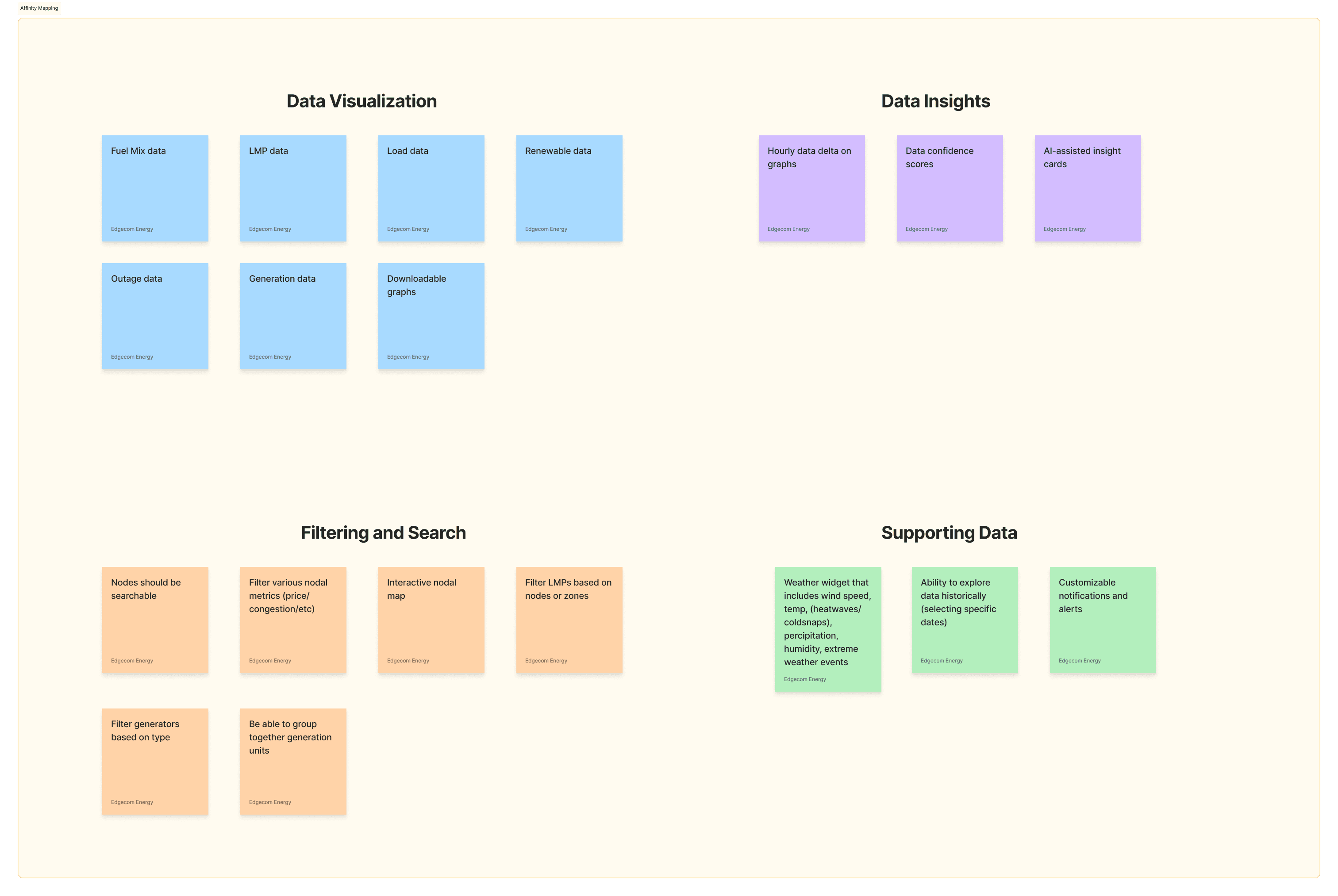
Based on the research and analysis done so far, I listed out potential key features and considerations we may need to account for during development.
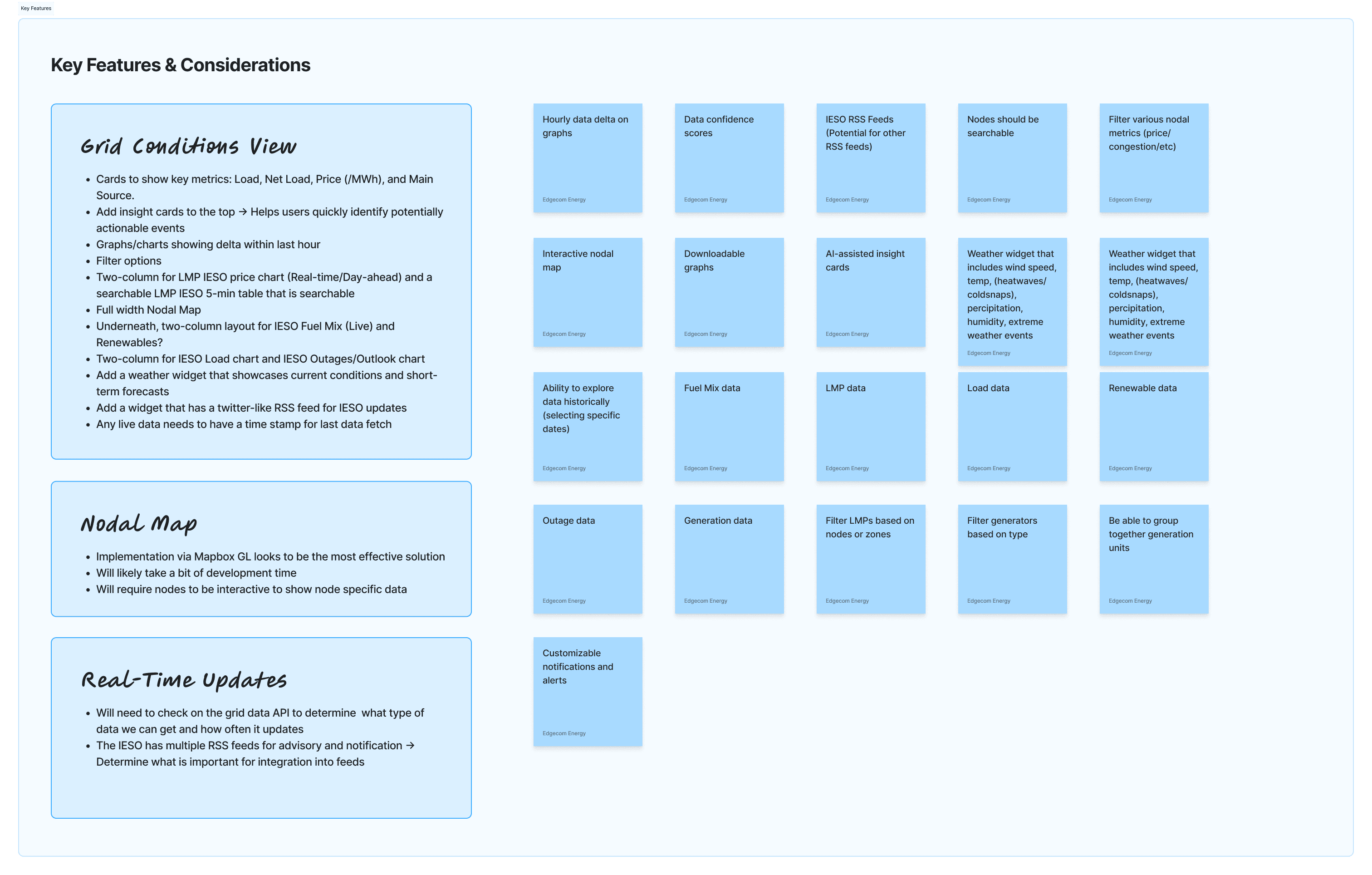
This was presented to our team during product development meetings, and we grouped these key features into four main categories in an Affinity Map.
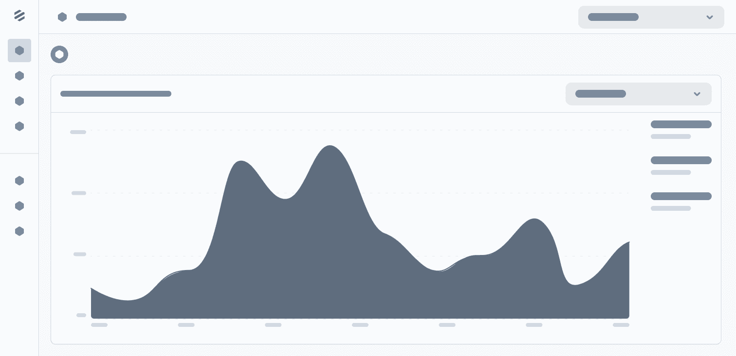
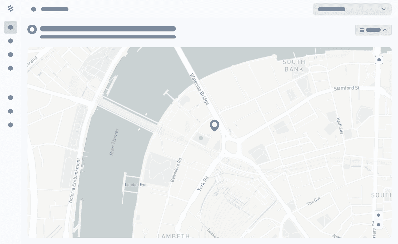
Keeping in mind our goal of reducing cognitive load and bringing important datato the forefront, I designed a solution focused on data visualization and proper content hierarchy to hide less import information that may be drilled down upon when necessary. The following represents the wireframes and designs of the dashboard.


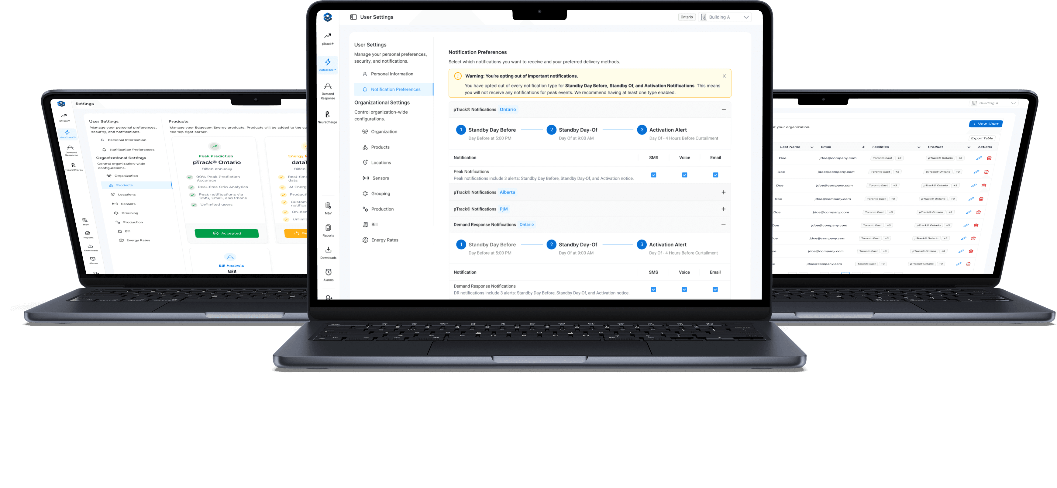
The redesigned settings experience delivered meaningful improvements for both end users and administrators. By introducing a clearer hierarchy and consistent visual structure, the interface became easier to scan and navigate. The move away from a tile-based layout allowed the settings page to scale as new features were introduced. On the notifications side, users gained direct control over their preferences, while administrators could now assign notifications to external members without relying on support. We also expanded admin functionality to include role management and the ability to assign facilities and products to individual users.
These changes not only simplified navigation but also reduced confusion and dependency on customer support for basic tasks. Internally, the support team reported fewer tickets related to settings and notifications, and organizational admins told us that it was much easier to organize their members across their organizations.
Results:
✅ Created a scalable information architecture that supports future product growth
✅ Simplified navigation with a clearer hierarchy and unified settings hub
✅ Enabled users to manage their own notification preferences without contacting support
✅ Added functionality for admins to assign notifications to external recipients
✅ Expanded admin controls to include roles, facilities, and product assignments
✅ Reduced support tickets related to notification management and settings navigation

