I led Edgecom Energy's front-end migration onto a design system published in code, then redesigned the process so designers, developers, and AI agents all build from it.

Edgecom builds energy management software for industrial and commercial operators: live demand data, battery storage controls, and interval meter reads across thousands of channels. The portal ran on Ant Design, and on the surface the problem looked cosmetic. Underneath, three structural costs had been compounding. Ant ships a runtime library and a CSS-in-JS engine to every browser, so users download and run framework code before they see their data. Much of the portal was built by a former offshore team, so our developers worked around inherited code rather than owning it. And because Ant is a pre-styled vendor library, every customization meant fighting its defaults from the outside. There was a business layer too: Edgecom positions itself as a tech-first company, we demo to investors, and the interface is part of the pitch. As the sole designer, I led the case to replace the foundation, built the design system that replaced it, and redesigned the workflow the whole product team ships through.
3×
Faster design approval
From ideation to signed-off design
75%
Faster to production
From approved design to shipped feature
~1 hr
UI assembly, down from days
From finished design to QA'd, production-ready UI
Goals
01
Update the UI framework tech stack and eliminate debt
02
Integrate AI into our workflow to accelerate
design -> ship speed
Redesigning How the Team Ships
This is the part of the project I care most about, because the biggest design surface turned out to be the workflow itself. The rule is simple: the registry is the single source of truth and everything pulls from it. Here is the workflow I designed around that rule:

The architecture as designed: one registry at the center, consumed by designers, developers, and AI on both sides.
01 — ONE SOURCE OF TRUTH
The registry sits at the center
Developers install components from it. I compose screens from those same components in Figma and Claude Design. Claude Code, our AI build agent, edits the authoritative system rather than a copy of it. Nothing drifts, because there is nothing to drift from.
02 — DESIGN
Compose, don't redraw
Screens are assembled from registry components instead of drawn from scratch. Because those components are the same ones running in production, a composition is already most of the way to a build.
03 — GOVERN
Onboard the AI like a new hire
The repository includes a guidelines file, agents.md, that every agent reads before touching the codebase. It encodes our accessibility rules, dark theme requirements, and a component-first constraint: always compose from existing registry components. Design governance, extended to non-human teammates.
04 — BUILD, HUMAN IN THE LOOP
AI accelerates inside the boundaries
Claude Code generates working UI against the registry. When a task calls for something custom the system doesn't cover, the agent stops and asks instead of improvising. People decide when the boundaries move.
05 — SHIP IN VERTICAL SLICES
One product at a time, end to end
Rather than reworking all designs, then all UI, then APIs, then testing, each product moves through the full pipeline on its own: design, UI build, API integration, testing, cutover. Our portal holds five segmented products, so every slice is self-contained and the process gets fixed before the next product inherits it. Everything is rehearsed on our internal admin portal first, where a rough edge never touches a customer.
We tested the full loop on the admin portal: finished designs became a QA'd, production-ready UI in about an hour, work that previously took days. The judgment that used to live in specs and handoffs now lives in the system itself, written once and enforced everywhere, at whatever speed the tools can run.
Unlike Ant Design, which are full libraries you import wholesale, shadcn components are source files you copy into your repository and own outright, with no runtime shipped to users and no customization ceiling. It also means we only ship what we're actually using, which helps performance. The design system lives in code, published as a public registry and documented at https://design.edgecom.ai. Here are a few specific parts of this system that I'm proud of:
Developers install real, owned components straight from GitHub with the shadcn CLI. Tokens ride along automatically, so the portal and every AI tool draw from the same source. A key part of the system is its guidelines and guardrails, which live in an agents.md file in the repository. It outlines specific design decisions, patterns, and things the agent should never do during the design and coding process.
It also matters why the system lives in code rather than in a design file. Because components live in code, we can link the repository directly to Claude Design and Claude Code. This is much more accurate than letting the AI guess at design screenshots, and it produces more efficient code because it's not rewriting things on its own, it's taking what we've already written and reusing it. Because it lives in a GitHub repository, it also allows us to version control our system.
Build with semantic tokens, never hardcode.
System rule, enforced in the registry
Design files drift. Code is authoritative.
Why the source of truth lives in the repo
The registry wasn't built only for people. It was built to be consumed: by designers composing in Figma and Claude Design, by developers installing through the CLI, and by AI agents generating UI against it. That last audience is where the workflow changes.
My first major call was one most designers would resist: change almost nothing about the layout. Our users are industrial experts running operational software. They respond to demand events, manage battery schedules, and monitor live grid data. Relearning an interface has a real cost for them, and a dramatic redesign would have imposed that cost for no operational benefit.
So I kept every control, flow, and navigation pattern exactly where users expect it. The refresh happens at the component level: modern, consistent, cleaner, with light and dark themes built in from the token layer. The transformation happens under the hood, where a heavy runtime and years of legacy workarounds get replaced by a system we own. Where I could identify improvements, I did update how certain information is visually conveyed, but all of it still lives where users expect to find it.
Restraint was the design decision. The portal should feel current without asking a single user to relearn their job.
Design principle: familiarity as a feature
That restraint also set up the hardest conversation of the project. If users would barely notice the change, why would leadership agree to spending three months of human resources on it?
Stakeholders looked at roughly three months of work and asked a fair question: why spend that on what appears to be a minor visual refresh? The pushback was reasonable, and answering it meant changing what the project was understood to be.
01 — THE OBJECTION
Three months is a serious investment, and the visible change would be small on purpose. Priced as a visual refresh, the project loses. So I stopped selling it as one.
02 — THE REFRAME
This was a tech stack migration: shed the heavy runtime for a faster data-dense portal, replace inherited code with a system we own, and move the design system from Figma into a tokenized code registry that unlocks an AI-assisted workflow.
The argument that landed was the payback. Months of upfront foundation work traded for a permanent increase in shipping speed, with every screen built after it moving faster. Leadership approved, and our first admin portal tests are already proving the projection right. In early testing, we were able to go from design to a fully functioning UI shell within hours instead of days.
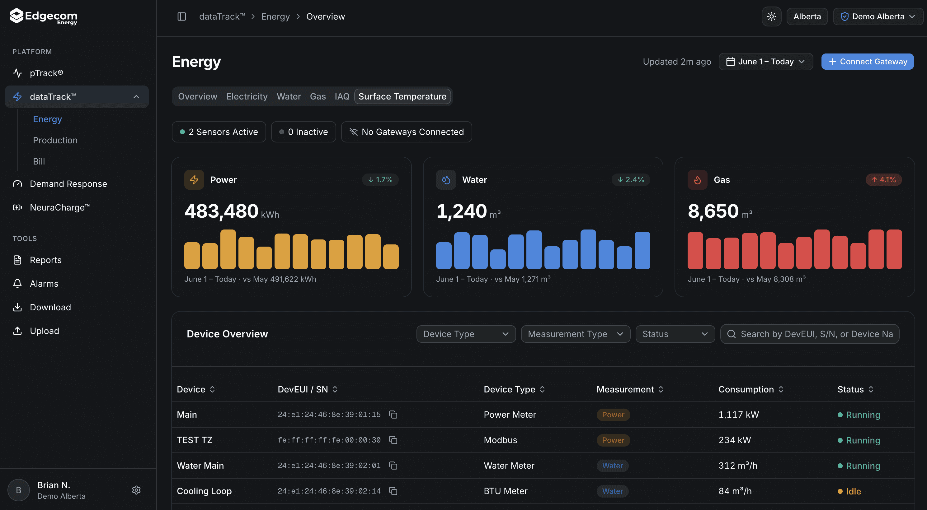
The visual refresh follows the same discipline as the migration: everything in its place, everything modernized. Components pick up cleaner geometry, consistent spacing, and semantic color, while light and dark themes come from the same token layer instead of a retrofitted skin.
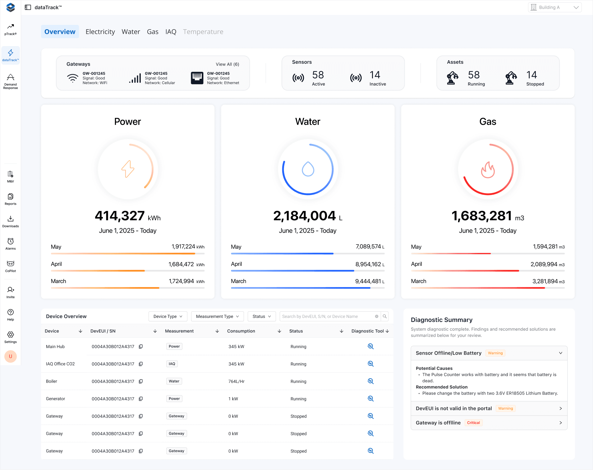
Screens keep their information architecture while the surfaces beneath them change: tables, charts, and controls rebuilt from registry components, tuned for data density and legibility across an operator's long shift.
The desktop comparisons start from the portal as it runs in production today. The reskins that follow are early explorations, not final screens: layout, spacing, and content are still moving.
PTRACK® — LIVE PEAK FORECASTING (Original Design)

PTRACK® — LIVE PEAK FORECASTING (New Design)


DATATRACK™ — ENERGY OVERVIEW (Original Design)
DATATRACK™ — ENERGY OVERVIEW (New Design)

MOBILE — THE SAME SCREENS, RESPONSIVE


The same screens at phone width, from the same components. Early iteration.
The Challenge: Guidelines and Guardrails
The workflow did not arrive working perfectly. Testing exposed a gap between AI agent assumptions and our design system. What wasn't explicitly outlined, the AI would make assumptions and these assumptions weren't always consistent across designs. Between myself and the frontend developers, we identified additional rules and guidelines to iterate on the agent's behavior.
01 — TOOL DEFAULTS DIFFER
Same file, two behaviors
Claude Code automatically scans the repository for guideline files and follows them. Claude Design applies them only when explicitly pointed at them.
02 — SILENCE BECOMES A GUESS
If it isn't written, it's assumed
Anywhere agents.md was silent, the agent filled the gap with a confident assumption. A human designer resolves ambiguity with taste, context, or a question. So I iterated the file constantly, converting implicit judgment into explicit instruction: error handling, component variant usage, which semantic toast fits which situation. Every surprising output became a new rule, and even with the rough edges the workflow still cut development time significantly.
AGENTS.md
## Do-nots
6 of 24 rules
-
Don't
hand-write a
component the
registry already
provides —
import it;
if none
fits, stop
and ask.
-
Don't
cram a
long, many-field
form into
a centered
modal —
use a
right
sheet
; keep
dialogs
for short
(1–4 field)
create actions.
-
Don't
fire a
neutral
toast()
for a
success/failure
outcome —
use the
matching semantic
variant
(toast.success
/
toast.error
/
toast.warning)
.
-
Don't
add accent
bars —
colored border
strips on
alerts/cards; use
the component's
variant
(-subtle
surface +
-emphasis)
instead.
-
Don't
leave async
failures as
a blank
screen or
an endless
spinner —
show an
error state
with a
retry (or
a toast
for failed
actions).
-
Don't
lighten
--primary
in dark
mode —
the brand
blue is
mode-independent; use
-emphasis
for lighter
primary text.
From AGENTS.md in the public design system repo. Every line exists because an agent once did the opposite.
This project is live and mid-rollout, so this section reports what has actually happened. It will grow as products cut over.
✅ Proposal approved. The reframe carried it: leadership funded the migration on the payback argument, not visual polish.
✅ Design system v1.0 shipped: built, published, and public at design.edgecom.ai.
✅ Workflow validated end to end. In the first full test on our admin portal, finished designs became a QA'd, production-ready UI in about an hour, work that previously took days.
✅ Measured so far: design approval is 3× faster from ideation to sign-off, and approved designs reach production 75% faster.
✅ Rollout underway. The workflow was hardened internally first, and the client portal cutover is proceeding product by product.
In today's rapidly evolving environment for product design and development, what designers and front-end developers do for their day-to-day job has really changed. This project has changed the day-to-day work of our front-end team. We now spend less time drawing screens in Figma and writing code by hand, more time deciding direction, orchestrating agents against the system, and reviewing what they produce.